

Due to the ubiquitous increased need for connection to the internet and communication between the people, nowadays, one of the most important things is to have a quality wireless network (WiFi).
Signal, speed, and coverage are three relevant technical factors to make it possible, but. Many times, a lack of knowledge about how to improve our WiFi signal propagation can affect performance and waste its potential.
Nevertheless, it is feasible to determine how the signal is distributed in the rooms, floors, or buildings of interest.
By using various mathematical algorithms, such as data interpolation algorithms, it is possible to represent this information in different formats and on different types of maps, with information on WiFi signal level, noise, channel overlap WiFi (co-channel), device density (TarLogic, 2011) and much more.
1. What is a WiFi heatmap?
Kim & Joukov (2017) studied the attenuating pattern of a wireless network, and they found that signal strength decays inversely proportional to distance.
For that reason, the WiFi coverage is typically embodied by a graphical representation of data, a heat map WiFi, where the colors (heat) represents the values of the received signal strength indicator (RSSI) and signal-to-noise ratio (RSN), as shown in Figure 2; the closer it is to 0 dBm (1 mW), the power is better and more stable; on the other hand, if the vales are closer to -100 dBm (0 mW), then it is weak and characterizes a lousy connection.
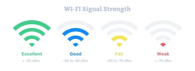
The signal-to-noise ratio is a calculation used in science and engineering that compares the level of the desired signal to the level of background noise (Gragido et al., 2013). Therefore, this heatmap will reveal areas with excellent connectivity, areas with interference, and also dead zones.
2. How to create a WiFi heatmap?
a) Download an app to create WiFi heatmaps
Throughout the internet, you will find many free apps to create WiFi heatmaps. However, some do not fulfill what was promised, or its limitations (i.e., operative system, characteristics, report details, the fidelity of the findings, etc.) do not allow the desired results, so we highly recommend NetSpot app to achieve an optimal WiFi site survey.
NetSpot It is one of the complete solutions for managing and supporting problems with the WiFi network. It is available for Windows and macOS operative systems, and it will allow us to analyze all the WiFi networks around us, showing us a lot of information about them.
For example, we can see the signal we receive, the channels used by the different wireless networks, if there is interference, noise, and much more information to optimize the WiFi network to have the best possible WiFi signal.
b) Draw your building (2D plane) and upload it
To find out where in your building, there is an excellent wireless connection to the internet and where it is not, the software needs to identify what it’s like in the first place.
You can draw an elementary plane in any software and upload the picture in .jpg or .png format. The objective is to give the software an idea of the dimension of the area over which it is being analyzed. Subsequently, you will have to choose two extreme points and place the exact measurement between them. Then, you can start working the analysis with that.
c) Move around your building to detect coverage, intensity, and interferences
Firstly, place yourself in an easy to identify an area in your building plane, now move the pointer to that place and click; repeat this process until you can completely cover all areas.
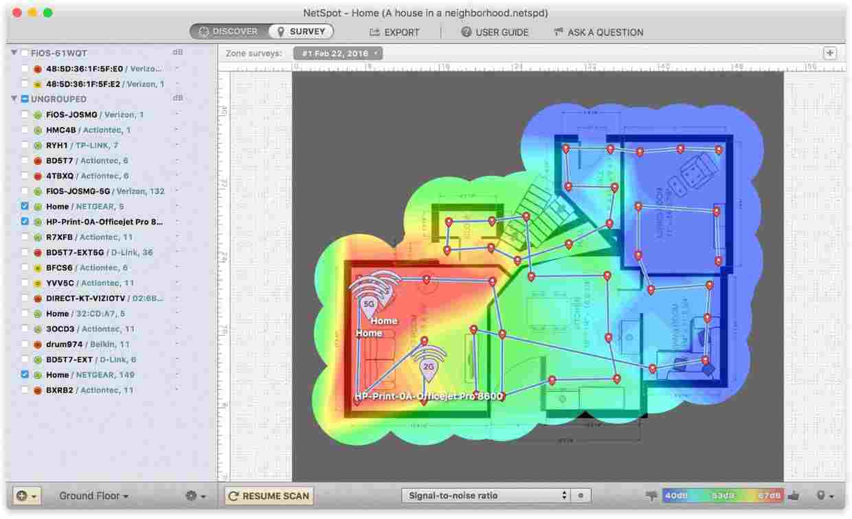
You’ll see that every time you mark a point in the WiFi coverage map, a value associated with that place is registered. As you add more and more to the plan, they will unite with each other with their respective colors leading to a complete map of signal strength and quality.
Once you’ve finished filling the whole area in your building, you will get the final product: the heatmap.
3. How to read a WiFi heatmap?
The interpretation you give to the results obtained will be crucial to lead to the desired optimization of the WiFi coverage. The heatmap that you made now shows you the distribution and range of your WiFi, where the signal is more reliable and where is weaker, so there’s only one factor left to analyze: the requirements we have to meet.
NetSpot software manages a range of colors from blue to red, where the first represents the worst signal strength and the other the best. If your desired signal strength for a room should be higher, then you can try three options to improve it: move the APs, add APs, or add repeaters (the Chu, 2017).
You should walk or combine all these in those points where the signal is showed in blue or purple tones if you want to cover dead zones, or also in yellow and green tones if you need a specific covered area to be improved a little bit more. Just remember to consider that building materials, real distance, and many factors can have an impact on how real-world works.
Now you can start making adjustments to your access points or WiFi repeaters location, moving them closer to shadow areas, based on what you want to improve.
If you’re going to see another indicator performance, you can examine it from the same software. It is also essential to look at your wireless connection safety: the more time you spend maintaining your wireless access point, your data will be more secure. These trends will help you plan your network optimization strategy.
4. Bibliography
- Chu, Wallace (2017). “How to create your own WiFi ™ Heat Map”.
- de Luz, Sergio (2018). “NetSpot: We tested this monitor to analyze WiFi wireless networks easily.” RedZone.
- Gragido, W., Pirc, J., Selby, N., & Molina, D. (2013). “Signal-to-Noise Ratio.” Blackhatonomics, 45-55.
- Kim, Kuinam J.; Joukov, Nikolai (2017). “Information Science and Applications.” Springer.
- Netspot (2019). “What is RSSI level?”.
- Tarlogic (2011). “Heatmap generation and WiFi coverage”.
Leave a Reply

Stay connected